Sequence Risk: Why the Order of Your Returns Can Beat the Average
Two retirees, the same average return, very different endings. Sequence-of-returns risk is why the order of your gains can matter more than the average, and why you cannot see it without simulating the path.

The first two posts in this series made a general case for simulation over prediction. This one is about a single, specific reason it matters, and it's the one that trips up almost everyone planning with a spreadsheet: the order of your returns can matter more than their average.
It's called sequence-of-returns risk, or just sequence risk. It only shows up when you're adding money to a portfolio or taking money out. If you buy once and never touch the account again, order doesn't matter at all. The moment there are cash flows, it matters a great deal.
The same average, two different outcomes
Imagine two retirees. Both start with $1M, both withdraw $40k every year, and both earn the same 30 yearly returns. The only difference is the order those returns arrive in.
Retiree A gets the bad years first and the good ones late. Retiree B gets the good years first and the bad ones late. Average them out and the two are identical. On paper they had the same market.
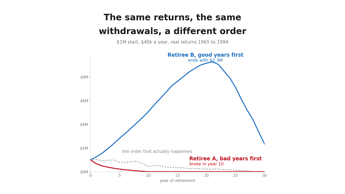
They don't end up in the same place, and the chart at the top of this post is the whole argument. Retiree A is selling shares to fund withdrawals while prices are low, so each withdrawal permanently removes more shares from the account. By the time the good years arrive there's less left to compound. On the real 1965 to 1994 returns, Retiree A runs out of money in year 10. Retiree B, on exactly the same 30 numbers, finishes with $2.3M.
The dotted line is the order those years actually arrived in, and it's the part I find hardest to argue with. Someone who retired in 1965 with $1M and drew $40k a year also ran out, in year 29, on a market that averaged 5.03% a year after inflation. The average was fine. The path was not.
Why a single projection hides this
A compound-interest calculator gives you one path: the smooth one, where every year earns the average. That path has no sequence risk in it, because there's no sequence, just the same number repeated. It's the one arrangement of returns that can never actually happen.
This is the same point the first post made with the fan chart, seen from a different angle. The smooth projection isn't the typical outcome. It's a specific, unusually lucky arrangement where the bad years politely spread themselves out. Real markets clump. The 1965 to 1994 window contains back-to-back years down 23% and 29% after inflation, and a plan built on the smooth line has nothing to say about what happens when those two land in your first decade.
What simulation actually does here
Monte Carlo fixes this by refusing to pick an order. Instead of assuming the average arrives every year, it draws thousands of plausible sequences of returns and runs the withdrawal plan through each one. Some sequences are kind and put the good years first. Some are cruel and stack the bad years against your early withdrawals. Most are somewhere in between.
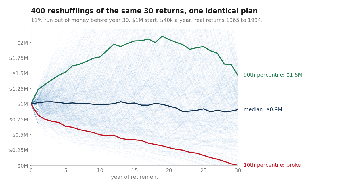
What comes out isn't a single ending balance. It's a distribution of them, and buried in that distribution is the number retirees actually care about: the fraction of sequences where the money runs out before they do. That has a name too. People call it the probability of ruin, which sounds dramatic, but it's exactly what you want to see before committing to a withdrawal rate.
Reshuffle those same 30 years 400 times and 11% of the orderings run out of money. Nothing about the plan changed between them. Same starting balance, same withdrawal, same 30 returns, same average. Only the order moved.
It's difficult to spot the risk in aggregate unless that path is actually modeled (a tangent that maybe I'll get into in the future but it's why resampled bootstrapping can be incredibly useful for modeling risk on sparse samples). The risk can often be the reality we're forced to play into (e.g. we need expenses to live and so are forced to withdraw at a steady rate even when the market doesn't play nice).
Where I keep running into it
Retirement withdrawals are the textbook case, but sequence risk shows up anywhere cash flows meet volatility. Dollar-cost averaging into a position is the same mechanic with the sign flipped: a rough early stretch is actually good for a buyer, because you're accumulating shares cheaply instead of selling them cheaply.
It also shows up in the leveraged corner of my own portfolio. A 3x fund doesn't just amplify returns, it amplifies the path. Two years that net to flat on paper can leave a leveraged position well underwater, because the daily reset compounds the wiggles, not the average (volatility drag). That's a sequence problem wearing a different costume, and it's a large part of why I model that sleeve with resampled paths rather than a single expected return.
The takeaway
When someone quotes you an average annual return and a tidy final number, the assumption buried in it is that order doesn't matter. For a lump sum left alone, that's fine. For anything you're feeding or draining over time, it's the whole question.
Simulation isn't a fancier calculator. It's the only tool that takes the order seriously, and the order is usually where the risk was hiding. If you want the origin story of how this technique came to exist, the companion piece covers the physicist, the card game, and the sick week that started it all.